Analyzing COVID-19 world data with PostgreSQL

Last year we got the biggest pandemic in the century and one of the worst in history. Everything closed, the global commerce stopped and many people lost their loved ones. In this post, I will extract some interesting data regarding the COVID-19 by using SQL.
Published on November 23, 2021 by Andrés Ingelmo Poveda
PostgreSQL SQL data analysis
10 min READ
COVID-19 is now part of our lives. It has broken many dinners, many beers and many trips. However, we have to learn to live with it. In the next few paragraphs, I will try to analyze some interesting facts from the pandemic just using SQL. More precisely, PostgreSQL
Dataset
The dataset used contains information regarding vaccinations, confirmed cases, confirmed deaths and other variables of interest for more than 200 countries since nearly the beginning of COVID-19. It is updated everyday by Our World In Data and contains metrics from multiple sources. You can check it in their Github repo.
I have taken all the data and built a SQL database using PostgreSQL in my Raspberry Pi so I can access it from all my local network. You can check my project and Python scripts used here.
Analysis
As I cannot print out the whole list of countries, otherwise the post would be incredibly long, I will sort the values descending and limit results to five. Let’s start writing queries!
What was the worst day of COVID in terms of total cases reported for the top countries?
COVID-19 hit every country in the world hard. However, some of them had worst days than others. The following query allows us to retrieve the top 5 countries of the world sorted by the number of new cases reported in their worst day:
SELECT
	t1.location AS location,
	MAX(t1.date) AS date,
	MAX(t1.new_cases) AS new_cases
FROM covid_data AS t1
INNER JOIN (
	SELECT
		location,
		MAX(new_cases) AS new_cases
	FROM covid_data
	WHERE new_cases IS NOT null AND continent IS NOT null
	GROUP BY location
) AS t2
	ON t1.location = t2.location AND t1.new_cases = t2.new_cases
WHERE t1.continent IS NOT null
GROUP BY t1.location
ORDER BY new_cases DESC
LIMIT 5
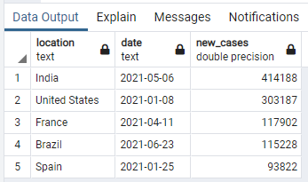
As we can see, India had the worst day in COVID history in terms of new cases reported on May 6th, 2021. Other countries, like Spain, did it on January 25th, 2021.
This data is good but all of the countries in the list are really big, let’s check the worst day in relative terms. To get that, we will measure the new cases by 1,000,000 people dividing the new cases reported between their population and multiplying by 1,000,000:
SELECT
	t1.location AS location,
	MAX(t1.date) AS date,
	MAX(ROUND(t1.new_cases / population * 1000000)) AS new_cases
FROM covid_data AS t1
INNER JOIN (
	SELECT
		location,
		MAX(ROUND(new_cases / population * 1000000)) AS new_cases
	FROM covid_data
	WHERE new_cases IS NOT null AND continent IS NOT null
	GROUP BY location
) AS t2
	ON t1.location = t2.location AND t1.new_cases = t2.new_cases
WHERE t1.continent IS NOT null
GROUP BY t1.location
ORDER BY new_cases DESC
LIMIT 5
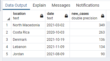
Now the list changed! North Macedonia takes the first place with 349 new cases per million people on March 2nd, 2021. This query takes into account the population of the country so we can measure the impact in smaller countries.
Worst days were COVID new cases were reported around the world
Well, we know the worst days for a list of countries but how about the world? When has the pandemic been hitting harder? With the following query, we can find out:
SELECT
	date,
	SUM(new_cases) AS new_cases
FROM covid_data
WHERE continent IS NOT null AND new_cases IS NOT null
GROUP BY date
ORDER BY new_cases DESC
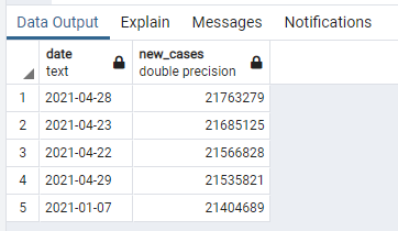
It looks like April has been a bad month. Four of the top five days have occurred during April being April 28th, 2021, the day where the most COVID-19 new cases were reported.
Percentage of people who died and its relationship with country life expectancy
Following with the previous question, it would be important to know how many people died (depending on their total population) of COVID-19 and its relationship with the life expectancy. Let’s find out if countries with lower life expectancy have a higher mortality rate:
SELECT
	location,
	MAX(life_expectancy) AS life_expectancy,
	SUM(new_deaths) / MAX(population) * 100 AS percentage_died
FROM covid_data
WHERE continent IS NOT null	AND life_expectancy IS NOT null AND population IS NOT null AND new_deaths IS NOT null
GROUP BY location
ORDER BY percentage_died DESC
LIMIT 5
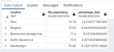
Wow! This results are frightening… In Peru, 14% of the population have died of COVID-19 since the beginning. It is terrific. Another countries with the highest mortality rate are in the Balkans area. Maybe they couldn’t control it in one country and expanded rapidly among the others.
However, it does not look that this countries have a low life expectancy. Let’s sort the results by ascending life expectancy to check if there is a relation between high mortality and low life expectancy.
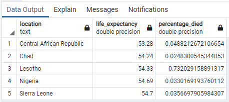
It seems that the countries with the lowest life expectancy doesn’t have the highest mortality rate and it make sense. We know that COVID-19 have a higher mortality rate the older the ill is.
Ranking of countries by percentage of population vaccinated
This year, vaccines began to arrive and people started getting immunized. It would be nice to know which countries have the biggest percentage of fully vaccinated people. We can achieve the results with the following query:
SELECT
	location,
	MAX(people_fully_vaccinated) AS people_fully_vaccinated,
	MAX(people_fully_vaccinated) / MAX(population) * 100 AS percentage_fully_vaccinated
FROM covid_data
WHERE continent IS NOT null	AND people_fully_vaccinated IS NOT null
	AND population IS NOT null
GROUP BY location
ORDER BY percentage_fully_vaccinated DESC
LIMIT 5
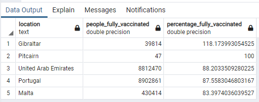
And this results are quite astonishing. We find that United Arab Emirates or Portugal have nearly 90% of the people vaccinated but Pitcairn, a small pacific island with only 47 inhabitants has 100% of their population vaccinated. But how about Gibraltar? How is it possible that 120% of their population is fully vaccinated.
Well, Gibraltar is a British territory in the South of Spain. The data of fully vaccinated people is measured in the number of completed doses they administrated so, maybe people from Spain were crossing the border to get vaccinated but do not live there.
Correlation between smoking population and total deaths
To end my analysis, I wanted to write a medium complex query. I want to know if there is a positive correlation between the countries with the highest percentage of smoking population and deaths. The following query allows us to get the result:
SELECT
	((tot_sum - (smokers_sum * deaths_per_100000_sum / _count)) / SQRT((smokers_sum_sq - pow(smokers_sum, 2.0) / _count) * (deaths_per_100000_sum_sq - pow(deaths_per_100000_sum, 2.0) / _count))) AS pearson_corr
FROM(
	SELECT
		SUM(smokers) AS smokers_sum,
		SUM(deaths_per_100000) AS deaths_per_100000_sum,
		SUM(smokers * smokers) AS smokers_sum_sq,
		SUM(deaths_per_100000 * deaths_per_100000) AS deaths_per_100000_sum_sq,
		SUM(smokers * deaths_per_100000) AS tot_sum,
		COUNT(*) AS _count
	FROM
		(SELECT
			location,
			(MAX(female_smokers) + MAX(male_smokers))/2 AS smokers,
			MAX(total_deaths) / MAX(population) * 100000 AS deaths_per_100000
		FROM covid_data
		WHERE male_smokers IS NOT null AND continent IS NOT null AND total_deaths IS NOT null
		GROUP BY location) AS t1
	) AS t2

The result proves our thoughts! A Pearson coefficient of 0.45 shows positive correlation. It is not as strong as expected because there are a lot of other variables to take into account when measuring total deaths by COVID-19. However, we can say that countries with a higher percentage of smokers have a higher mortality rate.
* For this result, I assumed that the percentage of males and females for each country was 50/50. This simplified the calculation and it is almost correct to affirm that as the gender distribution worldwide average is 50/50.
** There are some SQL clients that incorporate a built-in function to calculate the correlation. However, I wanted to make an universal query
End
This is everything for today! Thank you for reading until the end. I could continue writing queries until I got bored but the article would be endless. I have written more interesting queries in my GitHub repo. You can check it out here. I also built a dashboard built in dash with Python and HTML were you can browse all this information in real time and make your own comparisons. You can find it here.
If you liked my article. Please, consider reading another one from my blog or checkout my projects.