Usage patterns in Ford GoBike bicycle sharing

Have you ever wondered when should you take a shared bike? When are the busiest hours? In this post, you may find useful information regarding that matter.
Published on November 17, 2021 by Andrés Ingelmo Poveda
pandas jupyter notebook data analysis matplotlib seaborn data visualization
5 min READ
In this blog post, I’ll analyze the bike usage of Ford GoBike, a bike-sharing system covering the greater San Francisco area. The dataset contains more than 180,000 observations from February 2019 including trip duration, start and end station, member gender, among others. With this information we can reply questions like how long does the average trip take? or how does the subscription status impacts in the results? Keep reading to find out more.
Data structure
 #   Column                   Non-Null Count   Dtype
---  ------                   --------------   -----
 0   duration_sec             183412 non-null  int64
 1   start_time               183412 non-null  object
 2   end_time                 183412 non-null  object
 3   start_station_id         183215 non-null  float64
 4   start_station_name       183215 non-null  object
 5   start_station_latitude   183412 non-null  float64
 6   start_station_longitude  183412 non-null  float64
 7   end_station_id           183215 non-null  float64
 8   end_station_name         183215 non-null  object
 9   end_station_latitude     183412 non-null  float64
 10  end_station_longitude    183412 non-null  float64
 11  bike_id                  183412 non-null  int64
 12  user_type                183412 non-null  object
 13  member_birth_year        175147 non-null  float64
 14  member_gender            175147 non-null  object
 15  bike_share_for_all_trip  183412 non-null  object
Data wrangling
The data provided by Ford GoBike wasn’t as clean as we needed but I’m not going to focus my post in data cleaning. If you want to check all the steps that I took to clean the dataset, please take a look at the Jupyter Notebook associated with the blog post.
Univariate Exploration
One of the best ways to start analyzing data is by visualizing all the variables in a plot. In this case, I have plotted all variables in a grid to look for interesting insights.
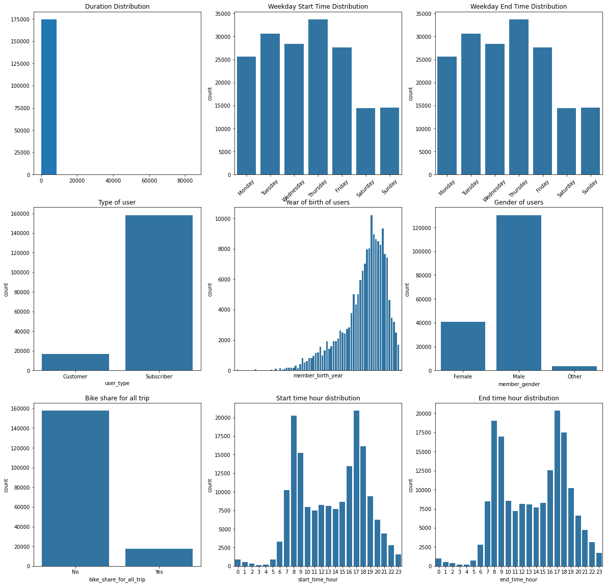
From this visualization we can get a few insights:
- Thursdays are the busiest day of the week.
- Most of the users are subscribers.
- Male is the predominant genre.
- 8 and 17 seems to be the rush hours.
But, as we can see, not all of them give us an interesting visualization. Two of them needs to be replotted: the distribution for duration and the year of birth of users.
Let’s start with the duration distribution. We will set a binsize of 10 seconds and a top limit of 3600 seconds to notice some differences.
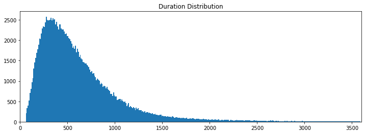
Now, we can clearly draw some conclusions from the histogram. The median time people rent the bike is around 500 seconds (or 8 minutes and a half).
Following with the year of birth distribution, by making the chart bigger, we can get some insights.
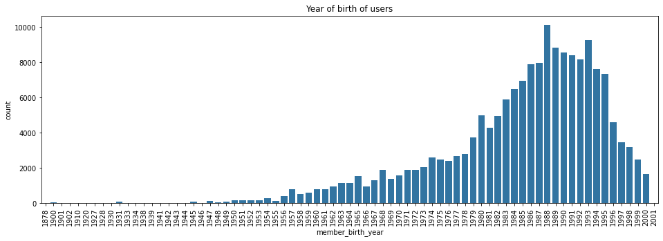
In this case, we can clearly see that majority of users were born between 1975 and 2000. Let’s zoom in to find out more:
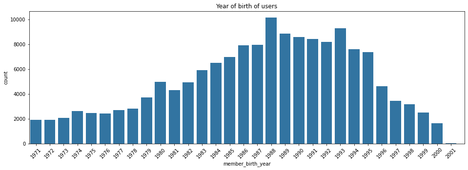
Now, it is clearly visible that the most common year of birth among the users of the platform is 1988 followed by 1993.
Bivariate exploration
After performing the univariate exploration, I will analyze the variables by plotting them together in pairs. Let’s start with the quantitative variables with the categorical ones.
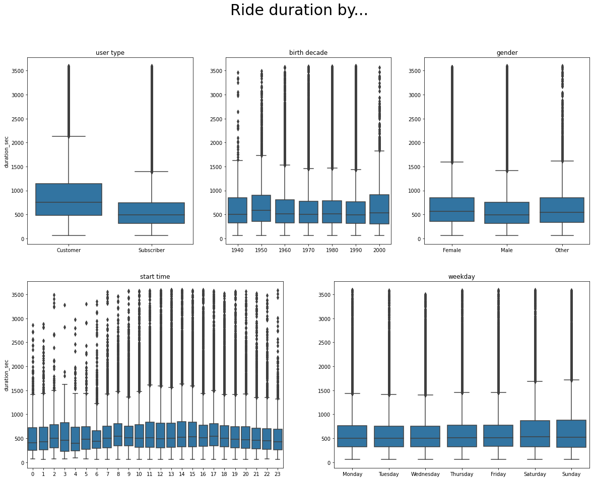
From this visualization, we can get some interesting insights:
- Customers use the bike for longer trips. This may be related with the usage. Subscribers might use the bike to commute everyday and prefer to pay a subscription rather than paying on the go.
- Female rent the bike for longer time than males. This can have to do with males cycling faster than females.
- During the weekends, the users take the bike for longer rides. This may be explained by the different type of use, for example, leisure activities.
However, performing bivariate explorations with categorical variables can throw interesting results as well.
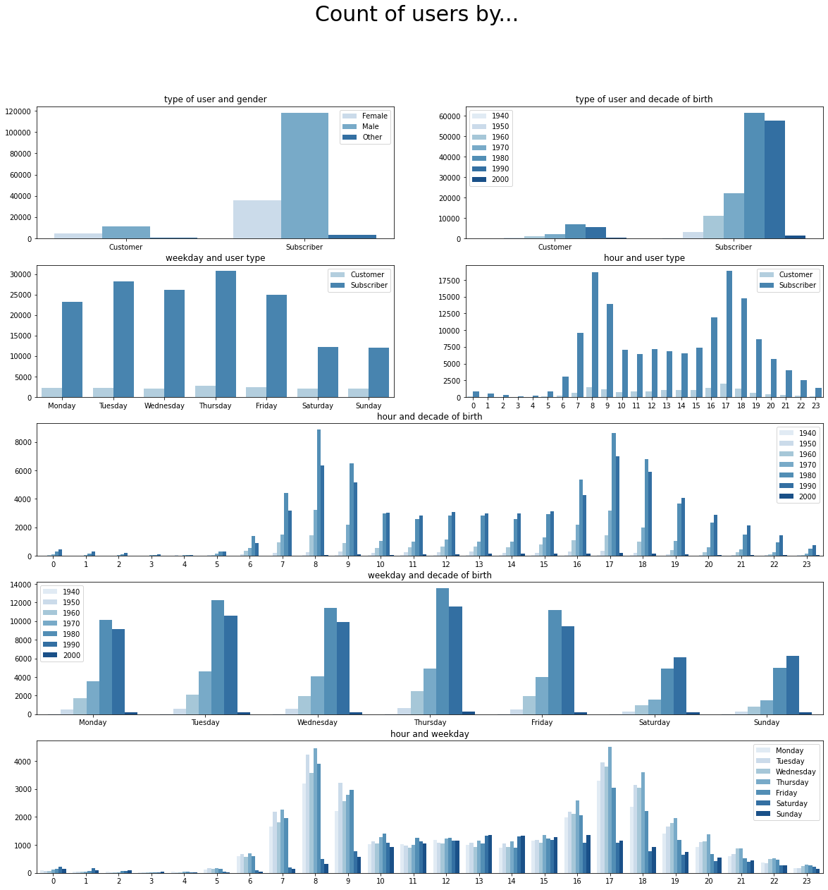
From this visualization, we can get extract the following:
- The proportion of male subscribers is higher than female subscribers. On the other hand, the proportion of male customers is not as high as female customers. Maybe, men have a higher chance of renting a bike casually than women.
- The number of bike rides on Saturdays and Sundays is lower, we knew that. However, the proportion of non-subscriber users who rent the bike on these days of the week is higher. In other words, less subscribers take the bike these days but the same amount of customers take it. This may have to do with leisure activities. Casual users taking the only on weekends while hardcore users taking the bike to commute only on weekdays.
- Very few people take the bike early in the morning during weekends. Also, during late night hours, more people rent the bike during weekends. This is probably related to people not having to wake up early during this time of the week.
Multivariate exploration
When performing analysis based on visualizations, we can also take into account multivariate plots. This takes into account more than two variables.
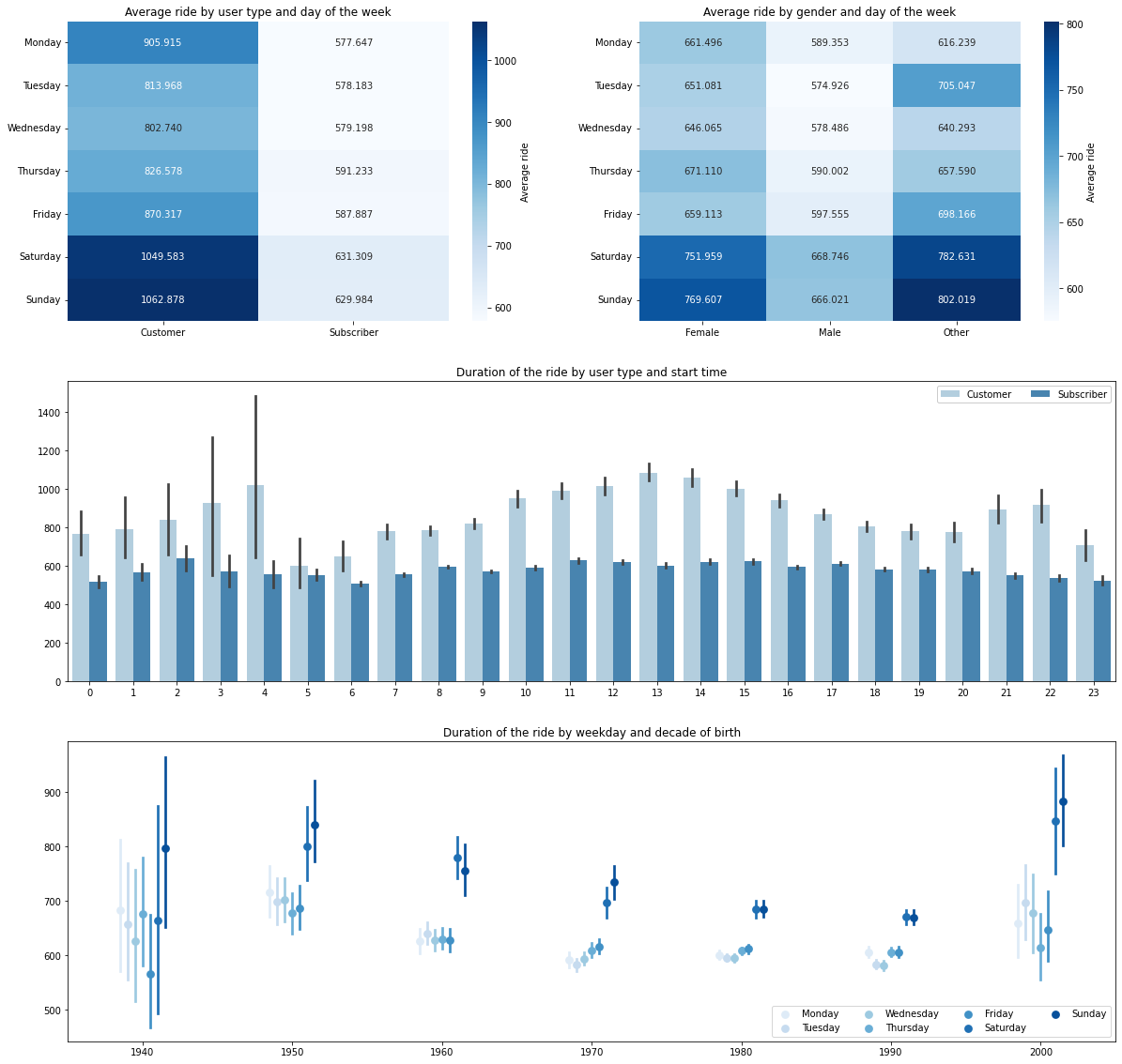
From this multivariate exploration, we can strengthen some of our previous conclusions:
- Now, we know that, on average, subscribers take the bike for shorter rides than customers. This might have to do with the cost of unlocking the bike. Subscribers pay a flat rate to unlock the bike while customers have to make the most out of paying for unlocking the bike.
- Weekend rides are longer than weekdays. We discussed this before. However, now it’s proven that weekend rides are longer. This might relate to the fact that, on weekends, people use the bike for leisure activities rather than commuting.
- Males rent the bike for less time than females. This might relate to the fact that men probably ride the bike faster than women or that women like to use the bike in a different way.
- It does not matter when the subscribers take the bike. The duration of the ride stays the same. This may have to do with subscribers knowing the city better than normal customers and going straight to the point.
- It also depends when you were born on how to use the bike. The older you are, the more time you spend on a bike, on average.
Thank you for reading until the end! For more information regarding Ford GoBike analysis, data wrangling and more visualizations, please take a look at my Github.
If you liked my article. Please, consider reading another one from my blog or checkout my projects.